Building a Bike Finder
Cannondale needed a better way to help people find a bike online.
My team
What needed fixing
It was hard to find and only lived in one section of the site, the nav.
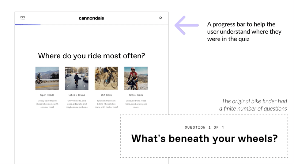
The questions weren’t dynamic and so the results were less than ideal.

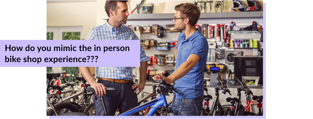
What was everyone else doing?
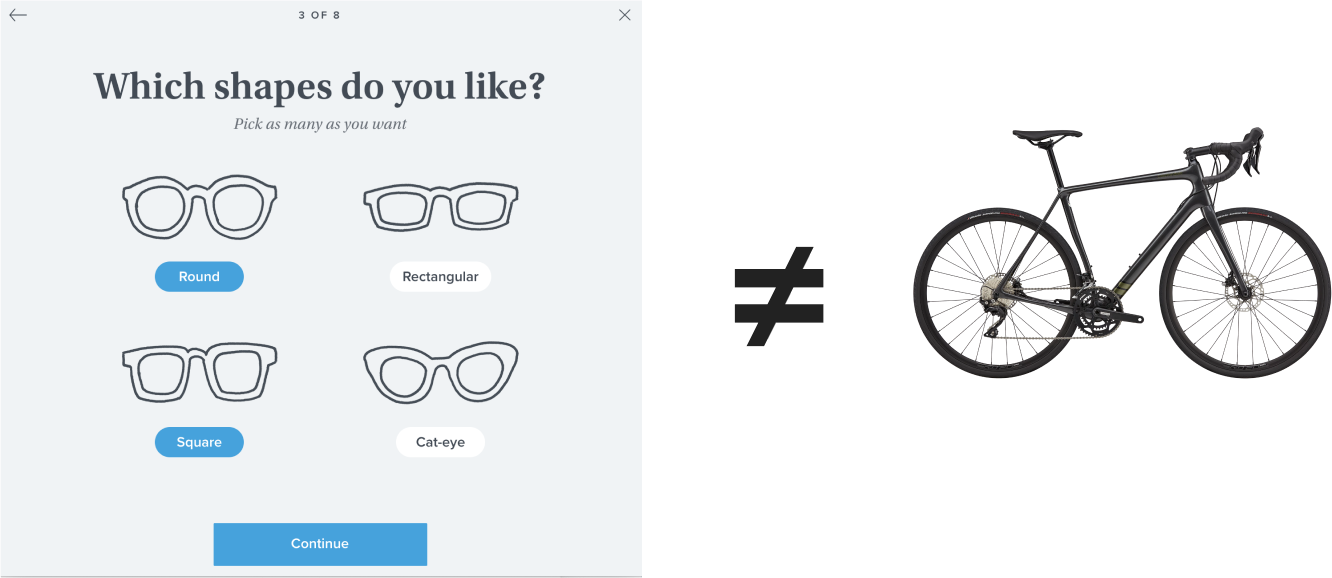
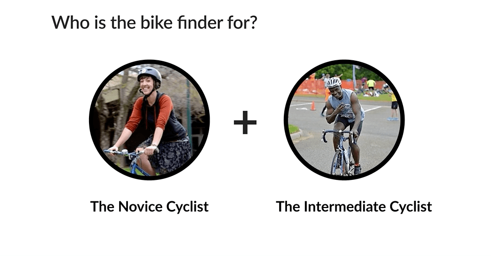
I took a look at some product finders within the cycling industry and outside of it. Everyone (leadership) kept raving about how great Warby Parker’s glasses finder was. But as I kept looking at it, it didn’t feel like this was the same problem we were trying to solve. Warby Parker’s glasses were all the same price, around $100. Our bikes had a huge range ($650 - over $10,000). I knew I had to prove out why we couldn’t just re-skin the beautiful Warby Parker glasses finder.
To prove my point, I needed to show the user journey
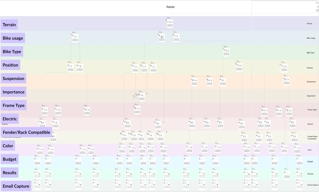
In order to make a scalable dynamic tool, I needed to architect it
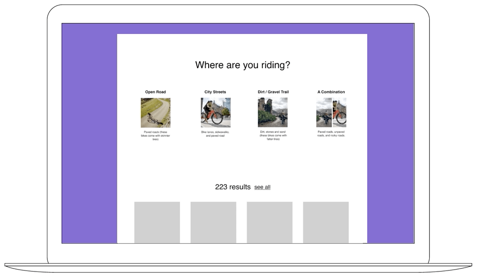
From there, I was able to create wireframes and build out a prototype to test with users
I wanted to know if we were asking the right questions and if users were getting the results they needed to help them find a bike they were looking for.
Tagging the Bikes
At this stage, my engineering team was able to build a working prototype from my designs. With this tool, I was then able to play around with the logic a bit more and start to really tweak the questions and answers as well as plug in the tags for the bikes. Tagging the bikes appropriately was very important in order to get the appropriate results for each question we asked. I created a spreadsheet of tags with my team. We would go in and add and edit them as we began to refine the questions and answers using the rough working bike finder from our engineering team.
At this point, it was time to tackle the visual design
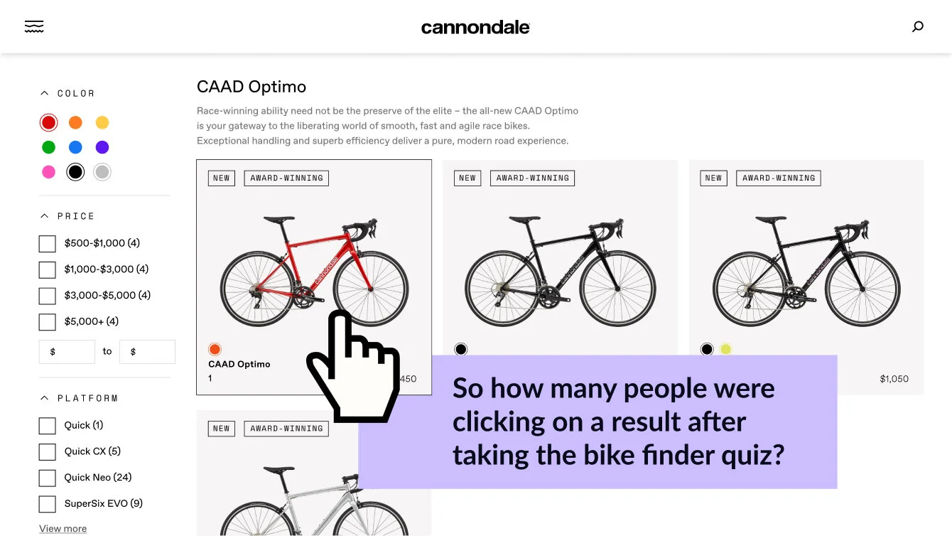
The results and redesigning filters
The results section became a bigger project all on its own. As it was, our filter system was very basic. I wanted the user to be able to turn variables on and off and see what their results were dynamically. Ultimately, the “bike finder” was a glorified filter system. And approaching it as such made it so that we could reuse the logic and the UI for the product landing pages throughout the site.
In order to see how well bike finder was doing, I needed some data analytics
Our findings showed
Only 4% more people were clicking on bike finder in 2021 vs 2021
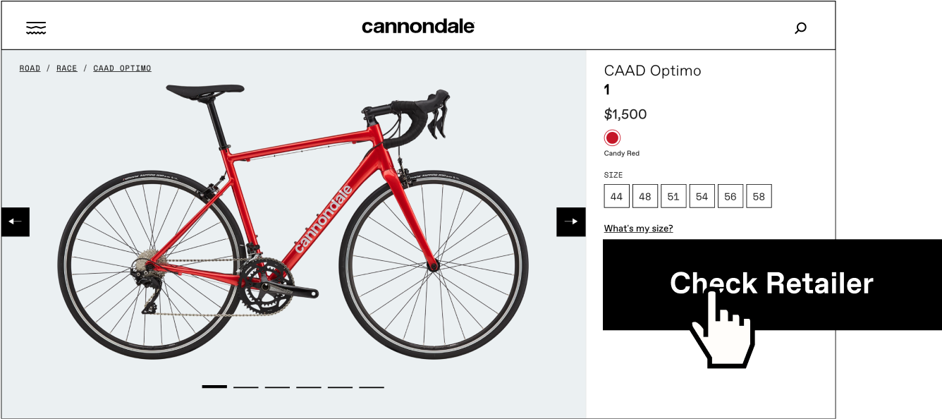
How many of these users go on to find a retailer?
We saw 17% of the users who completed the re-designed bike finder quiz in 2021 clicked on “Check Retailer”