Product Thinking
What are you trying to solve?
Improving the overall UX. This entails removing features that are overkill, rethinking information hierarchy, bringing the UI design to a place that reflects the brand and gives it a professional and elegant look.
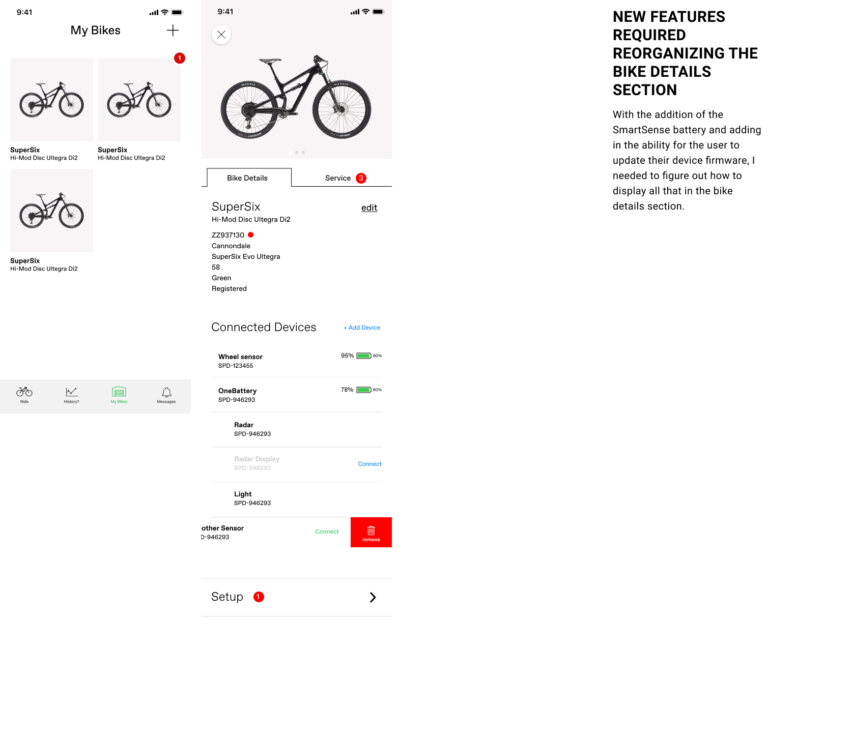
Adding new features to the app which would enable connecting and using external devices.
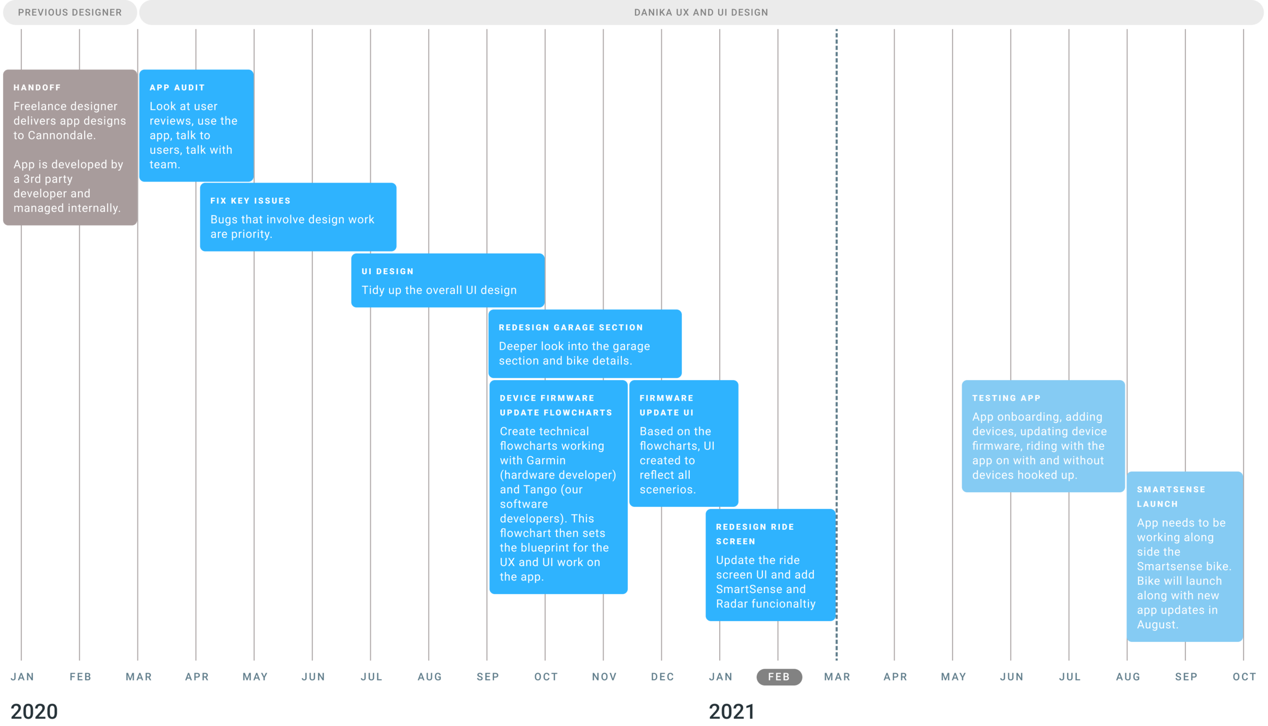
My Product Roadmap
User Feedback… not so great
Scanning the reviews on the Apple App Store, I knew a lot needed fixing. The priority was to fix the bugs. After that, the overall experience.
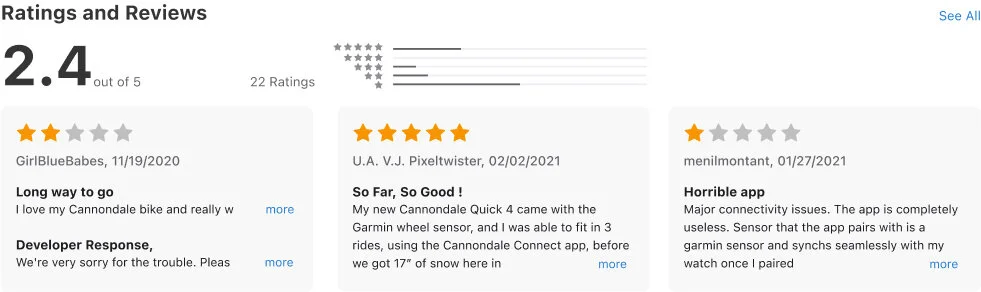
“To me, the app felt as if someone had built a skyscraper and it was tipping over, then they would keep adding more floors. ”
What does this app have to do with selling bikes?
Get more people to register their bikes. The business set a goal to collect more emails. More emails mean more opportunities to market to people later. Analytics showed that customers are more likely to register their bike (and agree to email marketing) if they download the app.
Drive sales and overall buzz for the new bikes that will come out in August of 2021 with the new batteries. The app will act as a dashboard to the battery and all devices connected to that battery (radar, lights, etc).
Visual Design
Pattern libraries and OS guidelines
Existing pattern libraries consisted of both iOS and Android human interface guidelines. It was important to maintain the design if and when necessary of both operating systems.
The Cannondale style guide is a constant work in progress within our small team of designers. We have brand guidelines and a style guide for the website that is fairly buttoned up. However, the app required many new elements. So a new section of the Cannondale style guide was created that was app specific.
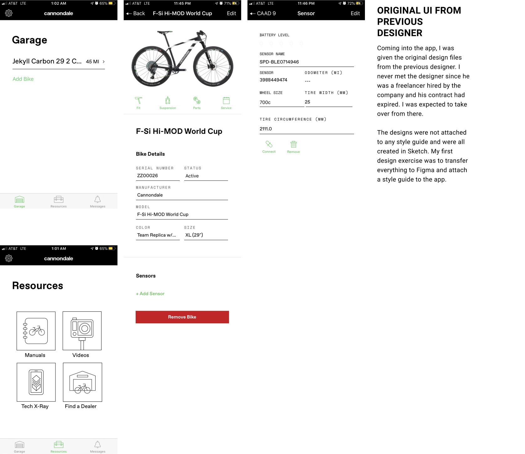
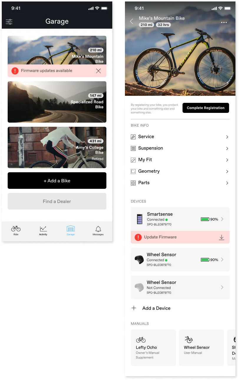
Iterations of the Garage & Bike Details section
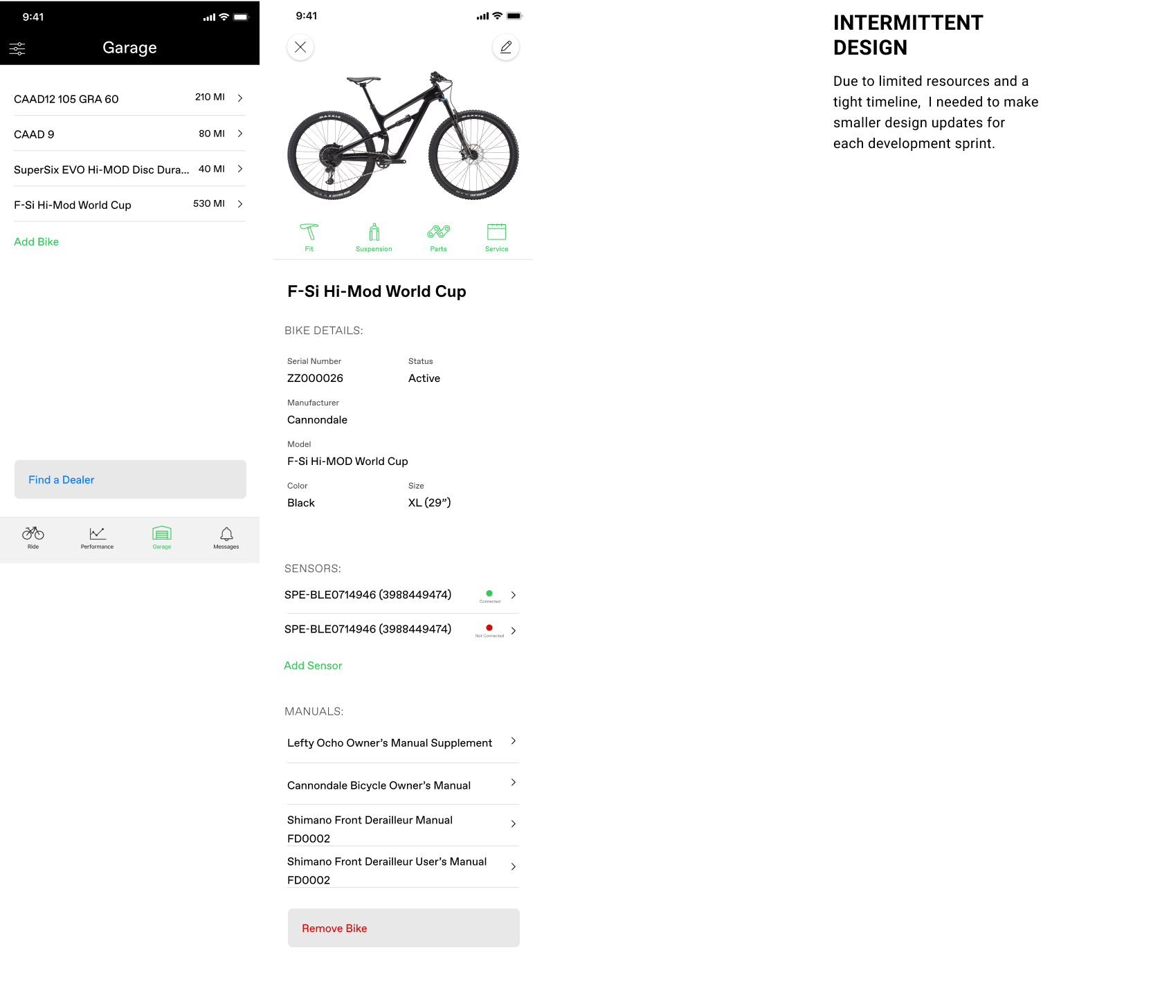
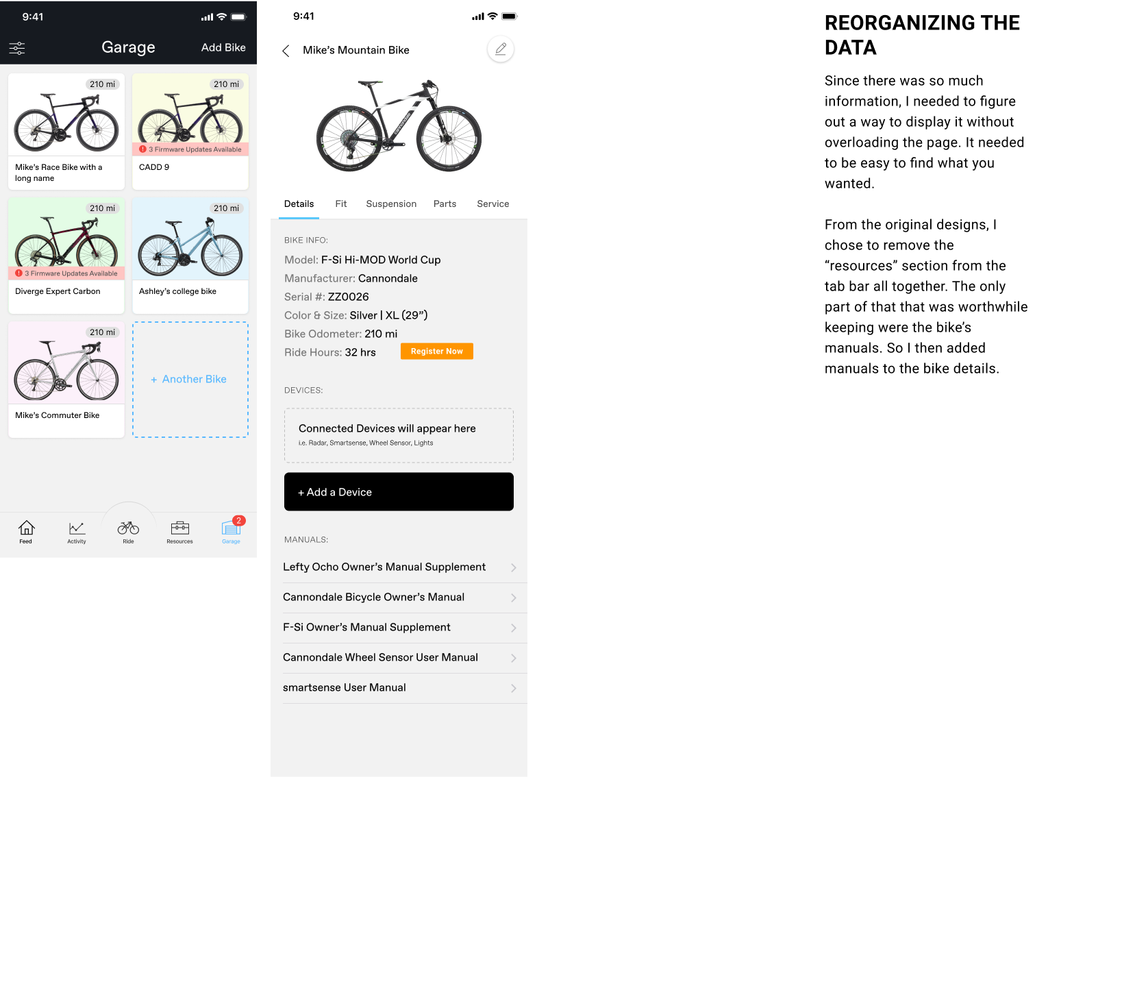
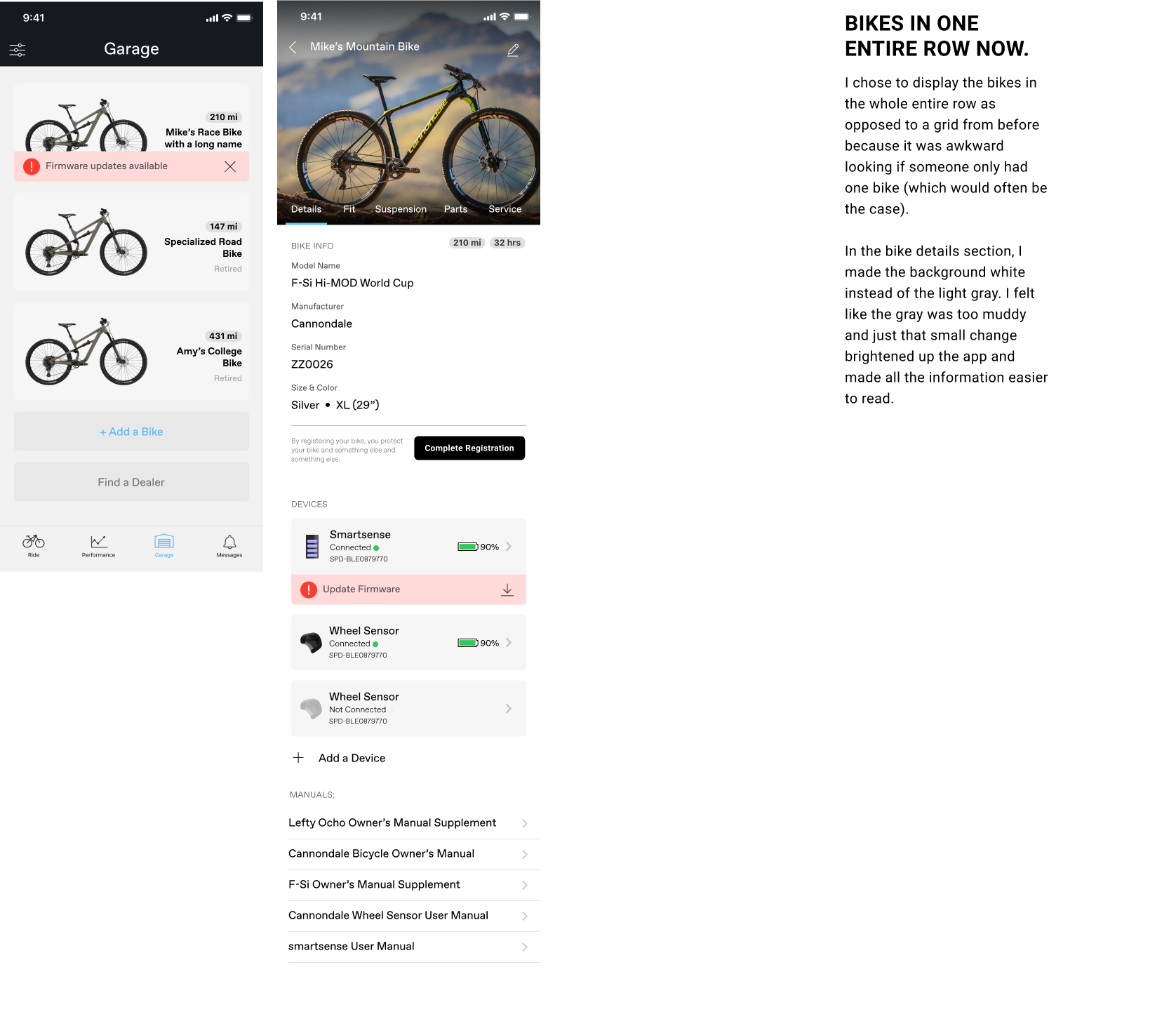
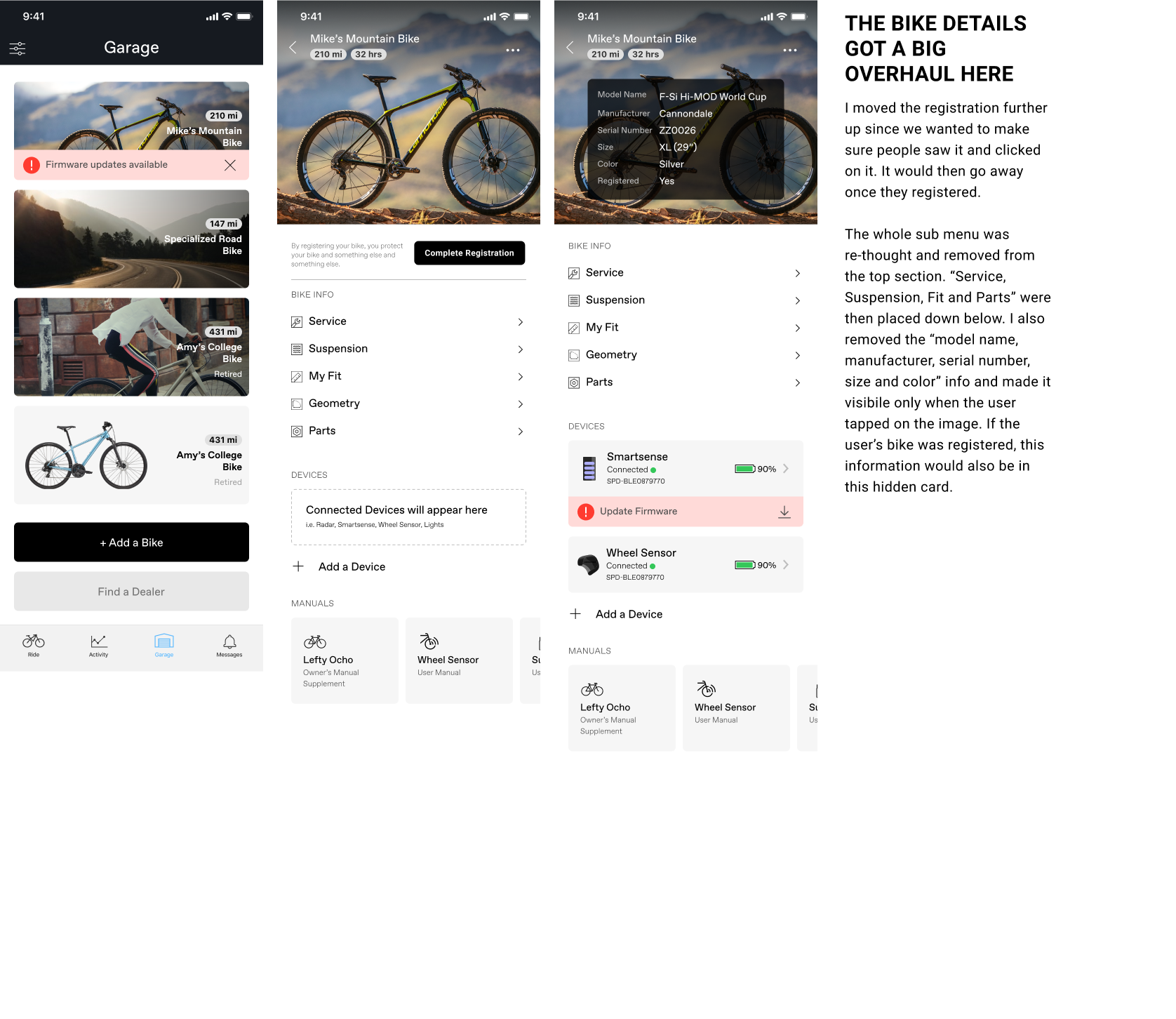
More refined design
Interactive Design
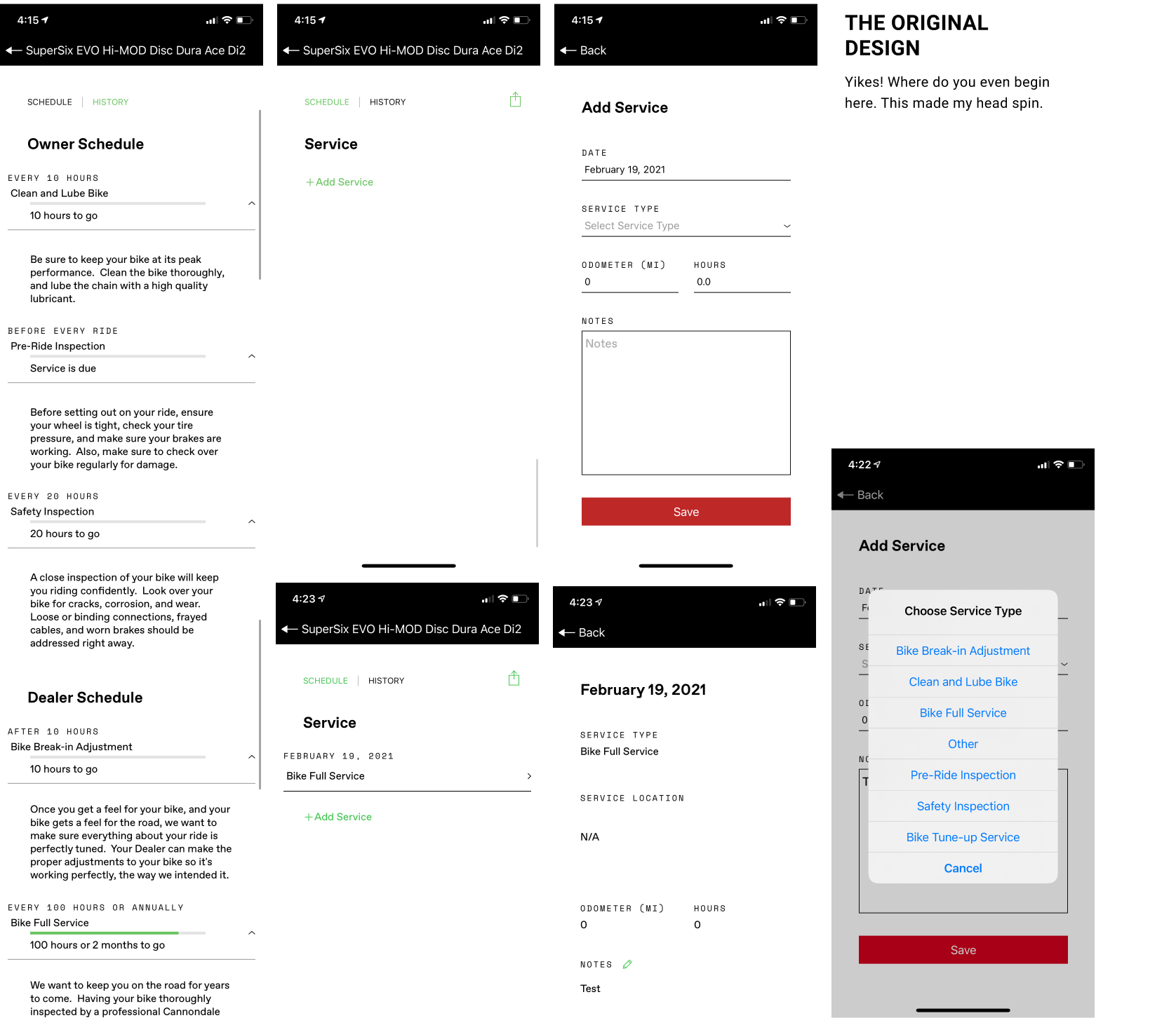
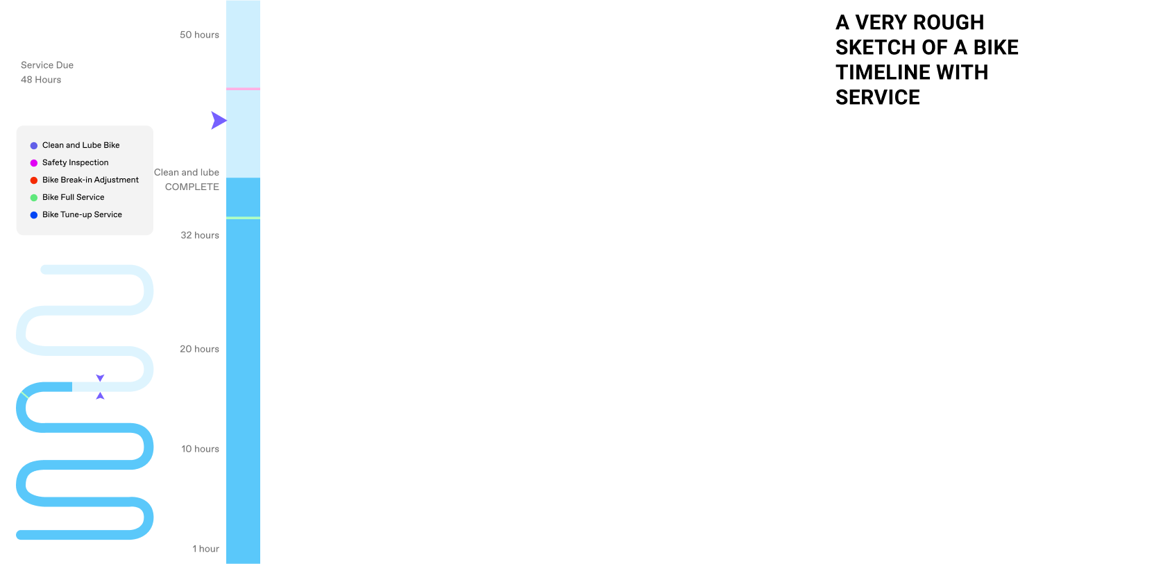
The Service Section, A challenging design problem…
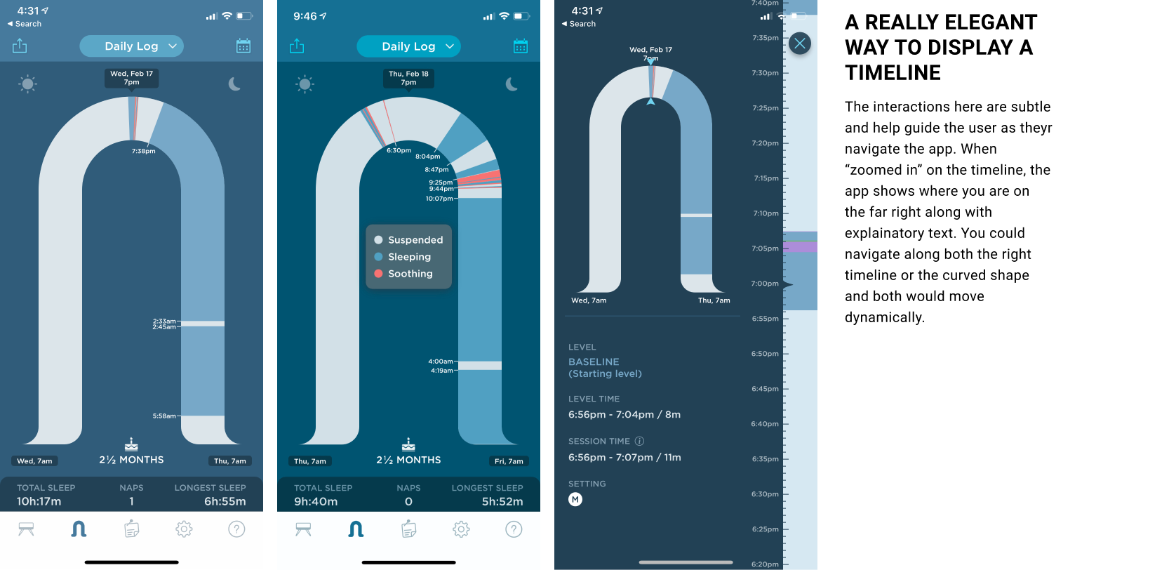
Nailing down how to showcase service to a rider has been a challenge. The original designs laid out a very rudimentary version. It’s not easy to digest and displays everything at once rather than what is relevant to you at that moment. In order to solve this problem, I took a look at other apps that designed timelines well. One of those apps was the SNOO app. A baby basinet product that came with an app. The user can view their baby’s sleep timeline each night.
Inspiration: The Snoo app
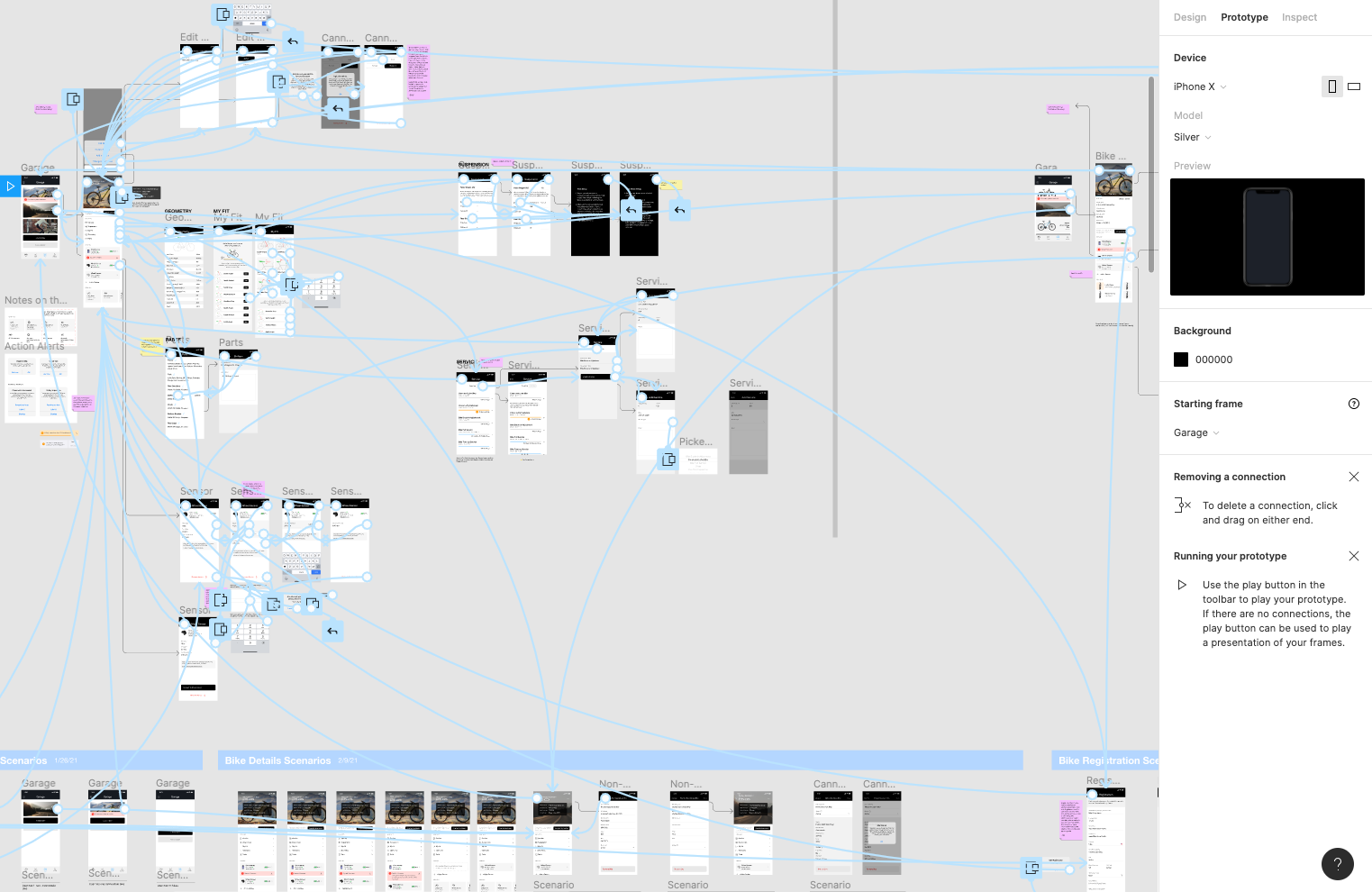
Protoyping
I created a prototype of the whole garage and bike details section of the app. This helped me see any inconsistencies in the design as well as gain a better sense of the app. The prototype also helped business stakeholders understand and approve the app as each stage continued.
When I’m working on visual and interactive design, I almost always have Figma mirror opened up on my device so that I can see how the design looks in my hand. The prototype also works while I’m in Figma Mirror so I’d often be tapping on my device as I’m designing in real time.
You can view the current protoype here.